A scatter chart presents data as x-y coordinates by combining two sets of numeric values into single data points. A scatter chart is typically used to display scientific and statistical data because it shows if there is a relationship between two sets of measurements. Use a scatter chart to compare, for example, salaries and years of experience, weight and body fat, rainfall amounts and pollen levels, or test scores and hours of study. The more data values you include in a scatter chart, the clearer the trends revealed by the data.
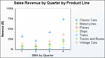
The scatter chart in Figure 6-16 shows the total revenue for seven product lines for four quarters in 2004.
|
Figure 6-16
|