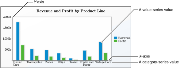
A chart shows the relationship between sets of values called series. There are two types of series: value and category. A value series contains numeric values, such as sales totals and salaries. These values determine, for example, the height of a column in a column chart or the size of a sector in a pie chart. For charts that use axes to display data, value series values appear on the y-axis.
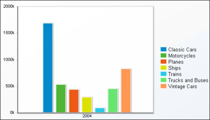
A category series determines how the values are grouped, for example, by year, by country, or by product line. For charts that use axes, category series values appear along the x-axis. For example, Figure 6-22 shows a column chart, displaying 2004 category series values.
|
Figure 6-22
|
For all chart types, you must select one dimension as the category series and at least one measure as the value series. You can select two dimensions to display two value series. The column chart in Figure 6-23 displays two value series, total revenue and profit. Then, depending on the cross-tab data that a chart uses, you can group and aggregate the values to customize the chart’s appearance.
|
Figure 6-23
|
The following topics describe the tasks you complete to select data for a chart. The tasks differ depending on the chart type you select.