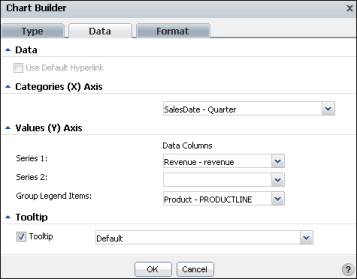
To customize an area, bar, column, line, or scatter chart, you can change the following values using Chart Builder—Data. Figure 6-24 displays values for a chart using the cross-tab values in the sample report document, Crosstab Sample Revenue.rptdocument.
|
Figure 6-24
|
|
|
In Data, you can select Use Default Hyperlink if it is available. If you select this option, you can hover the pointer over a legend item to highlight the corresponding item in the chart.
|
|
|
In Categories (X Axis):
|
From the items in the list, select which category to display on the x-axis. For example, the sample chart can display values for the product-line series for the year, for the four quarters of the year, for the twelve months of the year, or for each product line with no time-period grouping. Figure 6-24 displays the selection of SalesDate - Quarter.
|
|
In Values (Y Axis):
|
|
|
For Series 1, select a series. For the sample column chart, only the Revenue - revenue value is available.
|
|
|
For Series 2, select a series. For the sample column chart, only the Revenue - revenue value is available, so this field is blank.
|
|
|
For Group Legend Items, select which values to display in the legend, for example, Product - PRODUCTLINE. Select None to hide the legend.
|
From the available items in the list, select which value to display in a tooltip when you hover the pointer over an item in the chart. In the sample chart, for example, the default values that appear when the pointer hovers over a chart column are the category name, x-axis data value, and y-axis data value for the column. You can change the value to display a different value, such as Category Data, Value Series Name, or Value Data.