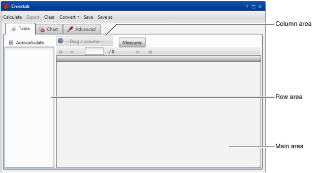
Using crosstabs
Video tutorials
A crosstab is an analysis that supports cross-tabulation, or pivoting, of different fields from a data source. The discrete values in a field are used as labels for either rows or columns. The default value for the cells in the table is the count of records that match the intersection of the column and row value. You can, however, add a data value for the cells separately.
Figure 4-1  
For example, you can set customer gender for columns, resulting in one column for male and one column for female. Then, you can set product line for rows, resulting in a row for each product line. The cells of the table by default show total product line purchases by male and female customers. Instead, you can show average product line profit by male and female customers or maximum product line unit sales per order for male and female customers.
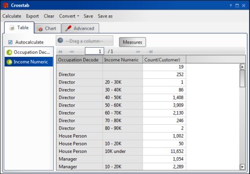
A crosstab that defines only rows is called non-pivoted. In a non-pivoted crosstab, a column appears for each field and rows appear labelled with the discrete values from those fields. The single, generated column on a non-pivoted table shows counts of records for each row combination. Figure 4-2 shows an example of a non-pivoted crosstab.
Figure 4-2  
When you have specified a resolution table that is different from the axis table and is at a higher resolution, use a field from the resolution table as a column. In other words, if the table results, or cell values, come from a different table than the row labels, you must use a pivoted crosstab. For example, to analyze Customer Occupation and Income Bracket at a higher level, by Household, define Occupation and Income Bracket fields as rows on a pivoted crosstab. Then, change the resolution table for the existing measure from Customer to Household, and add Household Country as a column.
When considering two fields to use in a crosstab, you typically use the field with more discrete values to label rows. Fields with a very high number of discrete values are less useful as a basis for pivoting a data set.
Creating a crosstab
To create a crosstab, in Analytics—Analysis, choose Crosstab. Then, define properties of the crosstab, using the following features:
*
Table provides an area for defining multiple rows and a column. To define a row or column, drag a field from Data Tree and drop it in the row area or the column area. As you drop the field, the crosstab appears in Table.
You can change the configuration of the table by changing the order of fields in the rows definition or by eliminating measures. You must define at least one measure to produce valid output.
Double-clicking a field in the row area provides the option to deactivate some of its values. If you select Autocalculate, data is updated immediately when you make a change to the analysis. If Autocalculate is not selected, you must choose Calculate to see your changes.
*
You can display data in charts and dynamic tables. For example, you can examine the number of orders by type of article to get average profits or a sum of purchase amounts.
A pivoted crosstab supports the following chart types:
*
*
*
*
*
*
*
*
*
*
*
*
*
*
The Columns 3D chart is shown by default.
A non-pivoted crosstab supports the following chart types:
*
*
*
*
*
*
*
*
*
*
Use Advanced to specify data for a table, including table axes or dimensions, simple or calculated measures, and filters. The following sections provide details about Advanced.
Understanding dimensions
A dimension is an axis of the crosstab, one of the fields which is crossed with another field to provide an analysis of the data.
You usually populate the dimensions of your crosstab by dragging a field from Data Tree and dropping it in the row area, column area, or main area of Table.
Alternatively, use Advanced—Dimensions to define rows and columns for a crosstab. Choose Calculate to update the table results.
Using a field as an axis on a crosstab automatically creates a measure for the count of the number of records with that discrete value. You can change the measures to something other than a simple count and set filters to limit the data included on the table.
Understanding measures
A measure in a crosstab is a value that appears in an individual cell. By default, a measure value is a count of the values that match the cross of the fields in the rows and columns.
To create a new measure, drag a field and drop it in the main area of Table. Select an operator for this field, for example sum, mean, minimum, or maximum. To render the crosstab, calculate the cells using the chosen dimensions and operator.
Use Advanced—Measures to change or add measures used in the analysis. In contrast to Table, Advanced supports adding complex measures that interact with other measures, changing or adding axes, and changing the order of the measures.
How to edit a measure
1  
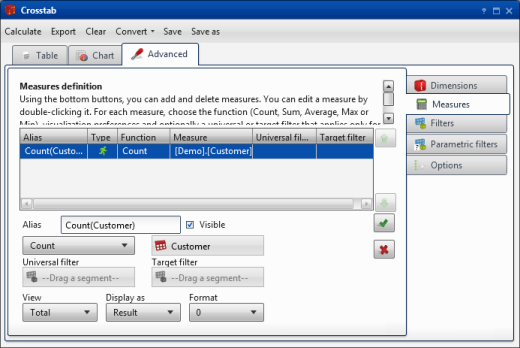
In Advanced, on Measures, select a measure, as shown in Figure 4-3. Double-click a measure to open it for editing.
Figure 4-3  
2  
3  
4  
5  
6  
To reuse a measure, drag the measure from one analysis window and drop it in another.
After defining simple or standard measures, you can define calculated measures. For example, to estimate cost per operation, define a calculated measure that divides the sum of operation costs by the number of operations.
How to define a calculated measure
1  
2  
3  
Approximate cost of operations
4  
5  
How to create a new measure based on an existing measure
1  
2  
3  
4  
How to delete a measure
1  
2  
About crosstab filters
You can set universal, target, and baseline filters. For more information about setting up filters for comparing values, see Applying a filter.
Selecting crosstab options
After creating a crosstab, use Advanced—Options to modify the crosstab appearance. You can choose whether or not to display blank rows and columns. For a graphical display of the table, you can set the maximum characters for axis labels, which determines whether the labels are complete, truncated, or hidden. Only pivoted and pie-style charts support showing a legend.
Optionally, you can set y-axis lower and upper limits for the crosstab chart according to crosstab maximum and minimum values. Setting these limits improves chart readability for a chart on which values appear too closely spaced. You can sort the results in ascending or descending order by measures.
Other crosstab functions
Crosstab provides the following tools:
*
When Autocalculate is not selected, choosing Calculate manually re-draws the table after you make configuration changes. Also, use this tool to redraw a chart.
*
Saves your crosstab as a comma-separated values (CSV) file for use in common spreadsheet programs or in other databases.
*
Removes the contents of your crosstab without saving.
*
Changes a crosstab analysis into a bubble, an evolution, or a map analysis. You may need to modify some settings to make the new chart type render in a correct and logical way.
*
Keeps a crosstab configuration in a previously named file. The file name appears in My Folders in Data Tree, overwriting the previous file. A prompt to establish the file name appears when you choose Save for a crosstab that has not been saved previously.
*
Keep a crosstab configuration in a new file. The new file appears in My Folders.
Video tutorials
Using a crosstab
Adding measures to a crosstab
Editing measures on a crosstab
Filtering a crosstab
Using a non-pivoted crosstab
Comparing measures in a crosstab
Formatting a crosstab
Using a prompted filter in a crosstab
Converting a crosstab to other visualizations

Additional Links:

Copyright Actuate Corporation 2013 BIRT Analytics 4.2