|
|
|
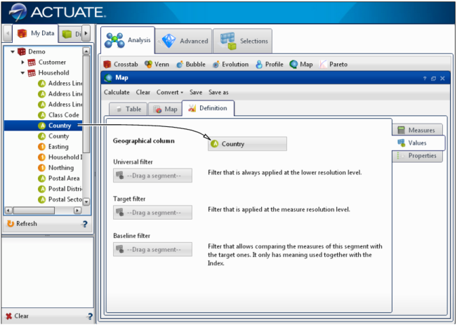
Figure 4-29
|
|
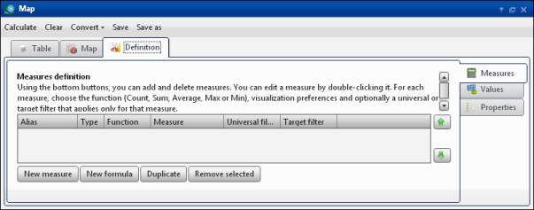
Figure 4-30
|
|
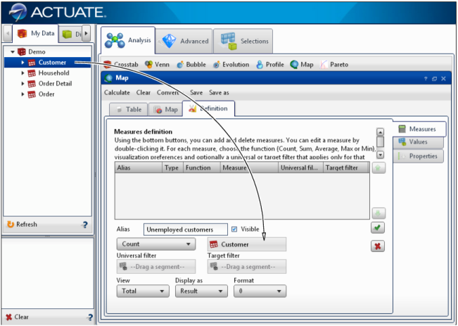
6
|
|
Figure 4-31
|
|
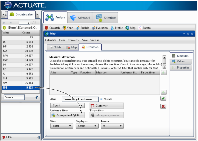
2
|