A Pareto analysis represents Pareto’s 80-20 theory with available data. Pareto’s theory states that:
|
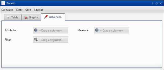
Figure 4-37
|
|
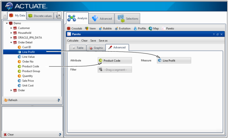
4
|
|
Figure 4-38
|
|
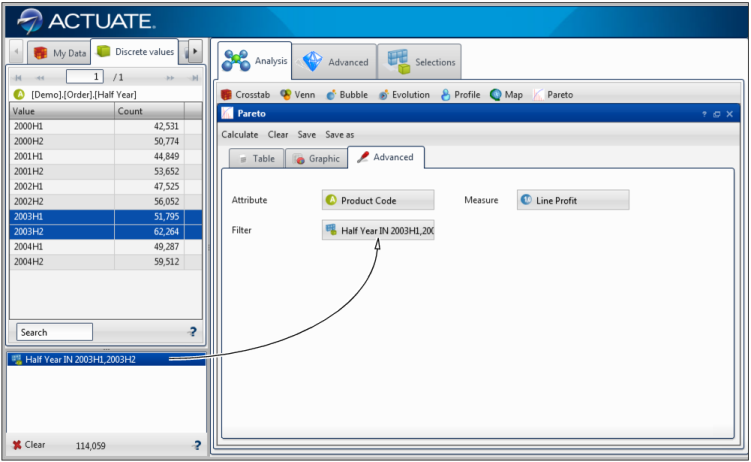
5
|
|
Figure 4-39
|
