Building a dashboard report
A dashboard report provides a concise view of key metrics. Those metrics might include costs, sales, customer satisfaction, or other measures critical for monitoring goals and trends. A dashboard report has the look and functionality of a dashboard in a car or plane, displaying data as a set of graphic representations.
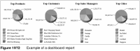
Figure 19‑2 shows an example of a dashboard report.
An effective dashboard report distills extensive detail data onto a single page, and highlights trends or potential problems. A typical dashboard report presents a series of charts to display data from different perspectives, for example, sales data by product, by customer, by sales manager, and by region, as shown in Figure 19‑2.
A chart relies on data derived from typically hundreds, even hundreds of thousands, of data rows. If the data is stored in a database, you can write a query that groups, aggregates, and filters the data to return a small subset of the rows that can be used as summary data for a chart. If a dashboard report displays multiple charts, creating multiple data sets, each running a different query, can be resource-intensive.
To build a dashboard report, it is sometimes more efficient to create charts that reference, or reuse, data in another report element, typically a table or a cross tab. A data set you create for a table or a cross tab frequently returns a large number of data rows, which the table or cross tab then groups and aggregates to display the data in an organized, readable format. By using table or cross tab data, it is possible to create a single data set that multiple charts access through the table or cross tab.
A key point to remember when creating a chart that uses data from another report element is that the sorting, groups, aggregations, and filters defined in the report element also apply to the chart. You cannot sort, group, aggregate, or filter data differently in the chart. Rather than being a limitation, this behavior helps synchronize the data in various report elements.
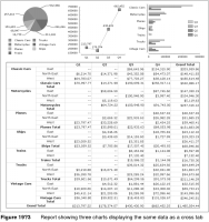
For example, the report in Figure 19‑3 shows a series of charts that use data from a cross tab. The cross tab defines a filter that enables the report user to specify at run time the quarters for which to get sales data. Each time the report runs with a different value, the cross tab and all the charts display sales data for the selected quarters. This report illustrates the primary advantage of using another report element’s data—dynamic and consistent data updates.