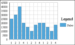
The charts in Figure 8-31 show sales numbers by month.
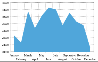
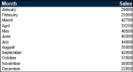
Figure 8-32 shows the table data that the charts use. The data in the table is already aggregated. The table shows the total sales per month. Each value is plotted in each of the charts.
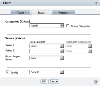
Figure 8-33 shows how the data is selected for the chart. You do not need to group or aggregate the data. As Figure 8-33 shows, all you do is select the Month column as the category series, and the Sales column as the value series.
|
Figure 8-32
|
|
Figure 8-33
|
The charts in Figure 8-34 show sales totals by quarter and by region.
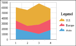
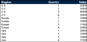
Figure 8-35 shows the table data that the charts use.
|
Figure 8-35
|
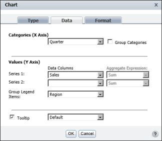
Figure 8-36 shows how the data is selected for the chart. The Quarter column is the category series, and the Sales column is the value series. In addition, Region is the column selected for the Group Legend Items option. Without this option selected, the chart plots every value in the Quarter and Sales columns, as shown in Figure 8-37.
|
Figure 8-36
|