When you format a column, line, or bar chart, you specify the properties in Flash Chart—Format in a similar way that you do for a standard chart. In Flash Chart—Format you can specify the title, chart size, dimension, and font properties, and legend properties. In addition, you can format the x-axis title, and label properties. You can also format the y-axis title, minimum and maximum values, as well as step value, as you would for a regular chart. The following section describes how you can work with each option in Flash Chart—Format.
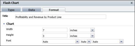
You can specify a chart title, width, height, as well as font properties for Flash charts using BIRT Studio. Figure 8-84 shows an example of a line chart that uses the default font properties. When using a line chart, you cannot specify a chart subtype, or dimension, as you can for bar or column charts.
|
Figure 8-84
|
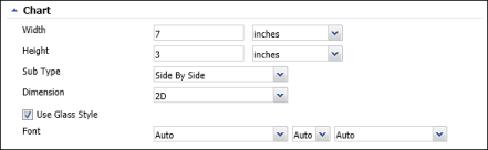
Figure 8-85 shows an example of a column chart that uses the default font properties. In addition to specifying the size for bar and column charts, you can select a subtype, dimension, and specify font properties, as you do for BIRT charts.
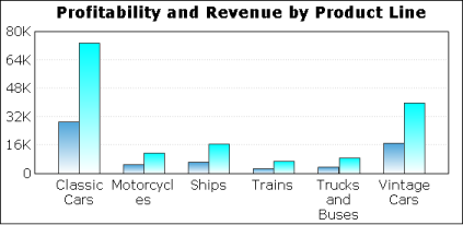
When working with two-dimensional column or bar charts, you can also specify whether to use glass style to display the chart. Select Use Glass Style to display the bars or columns in the chart with smooth, rounded edges. Deselect Use Glass Style to display angular, sharp edges. Figure 8-86 shows two charts that use the same data. The chart on the left does not use glass style, while the chart on the right uses the glass style option.
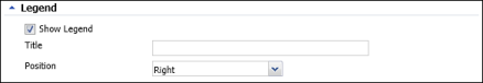
Using BIRT Studio, you can specify whether to display the legend for a Flash chart. If you choose to display the legend, you can specify a title, as well as position for the legend to the right of the chart, or below the chart, as shown in Figure 8-87.
|
Figure 8-87
|
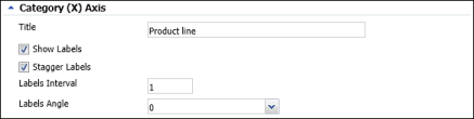
You can specify a title for the category axis and specify whether to display labels for x-axis values. If you choose to display labels, you can further specify whether to stagger them at an interval, or display them at an angle, as shown in Figure 8-88.
|
Figure 8-88
|
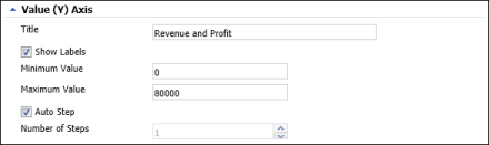
You can specify a title for the value axis, as well as the minimum and maximum value to display. In addition, you can choose Auto Step to enable BIRT Studio to determine the step interval, as shown in Figure 8-89, or use the menu to specify a step interval for the displayed values.
|
Figure 8-89
|