Plotting the x- and y-axes
You can drag and drop the data columns from Data Preview to the category and value definition areas to plot the axes. The chart builder writes expressions for creating visual chart elements based on the data columns you drag and drop. You can then enhance the expressions to plot computed or filtered data. For example, you plot dates along the
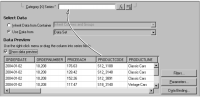
x-axis by dragging and dropping the ORDERDATE column from the data preview to Category (X) Series, as shown in
Figure 16‑5.
Figure 16‑5 Defining the x-axis expression
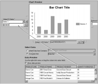
You can specify that the chart builder plot X-Y data points using one column of data, such as order quantity, multiplied by another column, such as price. You plot these data points by first dragging and dropping the order quantity column from Data Preview to Value (Y) Series, as shown in
Figure 16‑6.
Figure 16‑6 Defining the y-axis expression
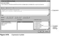
Next, open the expression builder to enhance the expression, as shown in
Figure 16‑7.
Figure 16‑7 Opening the expression builder
In the expression builder, which is described earlier in this book, you can view and select the available column bindings to add code for the bindings to your expression. You can also add operators, JavaScript functions, and BIRT functions.
You need to type the portions of the following expression that you cannot drag and drop. For example, the first line of the following expression applies a filter to the query of the Classic Models database to return only classic car data. The second line computes the revenue for each order.
if(row["PRODUCTLINE"] == "Classic Cars"){
row["QUANTITYORDERED"] * row["PRICEEACH"]}
Using this expression to define the Value (Y) Series expression plots data points using order quantities times price.
Figure 16‑8 shows the expression builder and available column bindings.