Using data from a table
A table is the most common element for displaying data. A table can display pages of detail data or just summary data. You can group data to show hierarchical views of the data, display aggregate information at any group level, and filter data at the table and group levels. Because you can manipulate data in a table in ways not possible at the data set level, the table is most often used as the source of data for charts, when presenting the same data in a table and a chart.
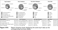
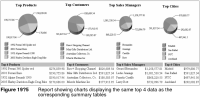
The report in Figure 19‑4 shows four charts and four tables that display summary sales data in various categories. Each chart uses data from the table below it, for example, the Top Products chart displays the top products listed in the Top 5 Products table. When data in any of the tables is updated, the data in the corresponding chart is updated, too. Figure 19‑5 shows the same report updated to display the top four performers in each category.
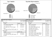
The previous report showed how you can base a chart on a table that displays summary data. You can also base a chart on a table that displays detail data. The report in
Figure 19‑6 shows two charts and two tables. The table on the left displays detailed sales data grouped and aggregated by order number and country, and filtered to display only sales in the top three countries. The Top Countries chart uses data from this table to display the sales totals for the top three countries. The table on the right displays similar sales data, except by sales representative instead of country. The Top Sales Representatives chart uses data from this table to display sales totals for the top three sales representatives.
Figure 19‑6 Report showing charts displaying the same data as tables with detail data