Using data from a chart
To display identical data in a series of charts, create one chart as the primary element, then create the other charts to use data from the first chart.
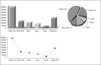
Figure 19‑16 shows an example of a bar chart, a pie chart, and a line chart displaying identical data, sales by product line.
Figure 19‑16 Three charts displaying the same data
In the example shown in
Figure 19‑16, the bar chart is the primary chart. The bar chart defines the data to use in the value and category series, and controls how the data is sorted, grouped, aggregated, and filtered. The other charts reuse this data; you cannot make any modifications to the data in the pie chart or line chart. To change the data that appears in all three charts, edit the bar chart.
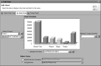
Figure 19‑17 shows the data definition for the bar chart. This chart uses data from a data set, Sales By Product Line. Value (Y) Series displays data from the TotalSales column, and Category (Y) Series displays data from the PRODUCTLINE column.
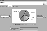
Figure 19‑18 shows the data definition for the pie chart, which uses data from the bar chart. Notice that the data specified in Slice Size Definition and Category Definition is the same data specified in the bar chart and is read-only.
Figure 19‑17 Data specified for a primary chart
Figure 19‑18 Data re-used from a primary chart