How to create a chart that uses data from a table
This procedure assumes you have already created the table that contains the data to share with the chart.
1 Specify a name for the table, using the following steps:
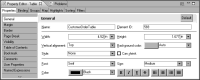
1 Select the table. In Property Editor, under Properties, choose General.
2 In Name, type a name for the table.
Figure 19‑7 shows the name, CustomerOrderTable, specified for a table.
Figure 19‑7 Name property set for a table
2 Insert a chart anywhere in the report, but do not place the chart inside the table.
3 In the chart builder, select a chart type suitable for displaying the data, then choose Select Data.
4 Select the data to display in the chart, using the following steps:
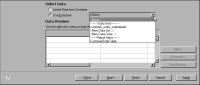
1 Under Select Data, select Use Data From, and click the down arrow to display a list of report elements from which data is available, as shown in
Figure 19‑8.
Figure 19‑8 Displaying the list of elements from which a chart can use data
The list displays the report items from which you can use data below Report Items.
Figure 19‑8 shows the table, CustomerOrderTable, under this category.
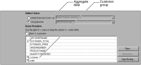
2 Select the table from which to use data. Data Preview displays the data from the selected table, as shown in
Figure 19‑9. In addition to the data fields used in the table, Data Preview also displays the groups and aggregate data defined in the table. Groups and aggregate data are identified by special symbols next to the column binding names.
Figure 19‑9 Data Preview displaying data from a selected table
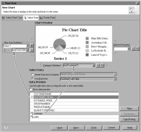
3 Select a group from Data Preview to use as the chart’s category series. You select data that is already grouped because you cannot group in a chart when using data from another report element.
4 Select aggregate data to use as the chart’s value series.
Figure 19‑10 shows an example of data selected for a pie chart. The customer group is selected for the category series. The CUSTOMER_TOTAL aggregation is selected for the value series, or, in the case of a pie chart, the slice size definition.
Figure 19‑10 Data selected for a chart
5 Choose Finish to close the chart builder.
5 Preview the report to verify that the chart displays the correct data.